Heatmaps: Graphing 3D data
A typical graph has 2 dimensions, one along the X axis and one along the Y axis. A way to graph another dimension is to add color.
Here are two examples of heatmaps created by Mark.
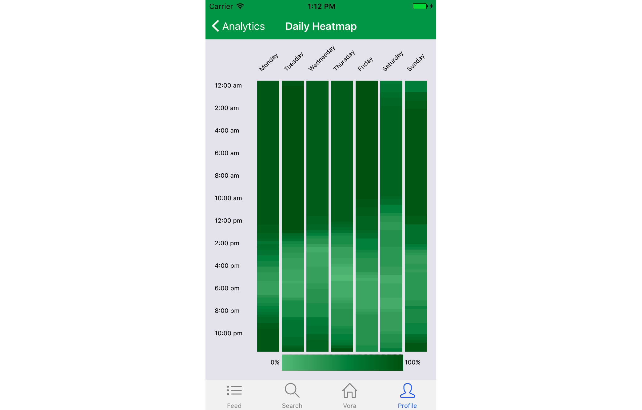
This heatmap is from the Vora app. On the X axis, you have day of the week. On the Y axis, you have the time of day. And the third dimension, color, shows what percentage the user is fasting for the given day and time. This graph shows that I usually ate breakfast on Saturday (at Kaleva Cafe), I'd eat late into the night on the weekend, and that I'd make up for the weekend with a small eating window on Monday. This heatmap was created from scratch using the D3.js library along with other data visualizations created for pro Vora users.
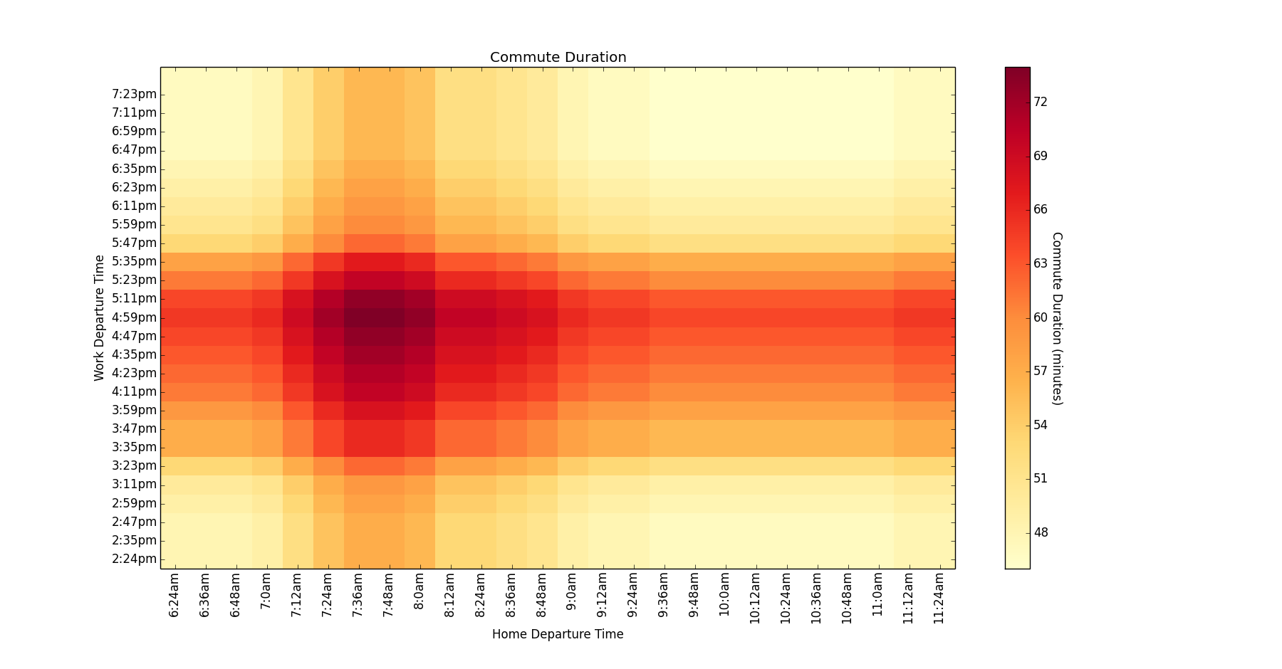
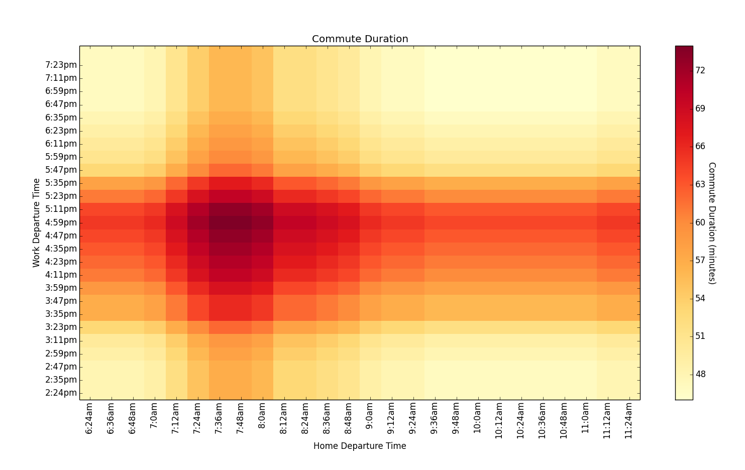
This heatmap was created by Mark when he was living and commuting in Minneapolis. On the X axis, you have Home Departure Time. On the Y Axis, you have Work Departure Time. And the third dimension, color, shows how many minutes I would spend commuting if I left at those times. I chose to leave for work at 9am and then leave work at 6pm. You can see from the chart that this helped alleviate the time I spent in traffic. The code for this heatmap uses the Python Matplotlib graphing library and is available on GitHub. The data was fetched using the Google Maps API.
Another example of heatmap data is Brent's analysis of his conversation with his wife. One example plot of this shows that Brent and Chloe mainly message during the work day, now that they are married.

Laurium Labs can parse, interpret, model, and visualize your data. If you want answers from your data, reach out today!